
How to Pair Colours Using the Colour Wheel
If you’re struggling to settle on a colour palette for your decorating project, then there are some ‘colour basics’ that might help you! Namely, the colour wheel…
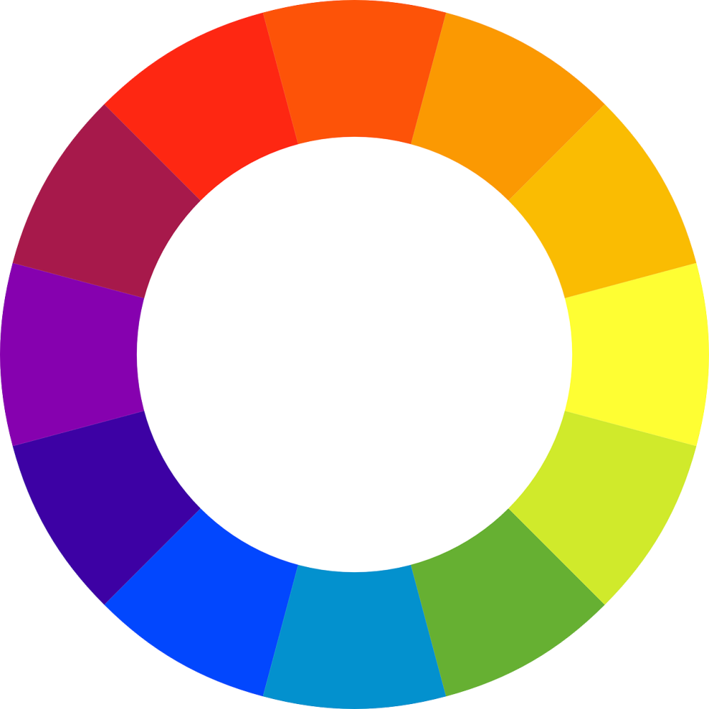
Back to school: What’s the colour wheel?
Take a look at the picture above. The colour wheel is a handy visual representation of primary, secondary and tertiary colours, and how they relate to each other (i.e. how to use them to best effect in your home).

There are three primary colours – red, blue and yellow (black and white are important colours too, but they don’t fall into the wheel). All the other colours in the wheel can be made from various combinations of the three primary colours!
Secondary colours come about by combining primary colours together. In the colour wheel, these secondary colours appear directly between their parenting primary colours. For example, between blue and yellow you’ll see green.
Tertiary colours come from mixing primary colours with secondary colours. For example, when primary colour yellow is mixed with secondary colour green, you arrive at tertiary colour lime.
So how do I use the colour wheel in my home?
I can hear you asking, ‘that’s all well and good, Callum, but how do I go about using this art-class knowledge when I’m looking for a colour palette in my living area?
Well, I’m glad you asked…
Complementary colours
Firstly, the colour wheel shows us complementary colours. i.e. colours that work really well together in a room.
To find colours that go together, simply pick one that you like and then look at the colour directly opposite it.
For example, if you’re looking at blue, the complementary colour is orange. If you use these two colours together, they create a dynamic and vibrant look.
Analogous scheme
On the opposite approach, picking colours that sit next to each other (for example greens and yellows) creates what interior designers call an analogous scheme. These are colours that work together harmoniously.
Hots and colds
Another great way you can use the colour wheel in your colour palette is to think of it as two halves – hot and cold.
From green round to purple, via the blues, you have the cool half. If you want to create a refreshing, friendly, energetic scheme, then these are the colours to go for. Greens symbolise nature and grass, whilst the blues and purples represent waters and skies – all cool themes.
If you’re looking to create a warm, cosy, relaxed look in your home all year round, you’ll want to choose the warmer half – yellows, oranges and reds – the colours of sunlight and fire – warm, rich, themes.
I hope that’s given you a good introduction to the colour wheel!